KRUMS | Bakery & Coffee Shop Branding
→Brief
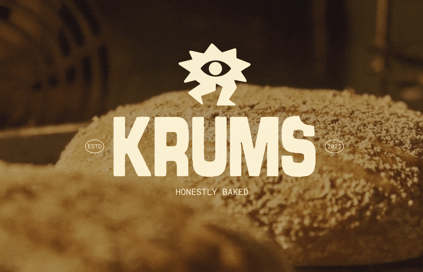
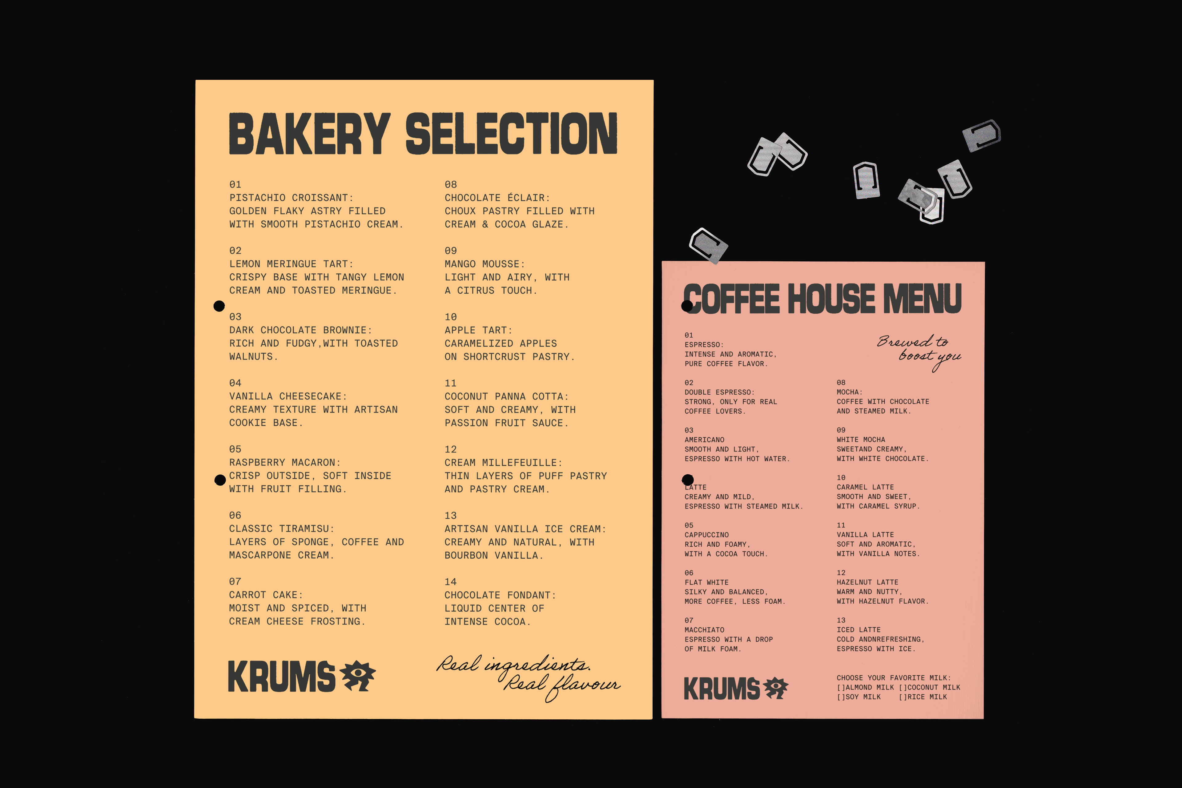
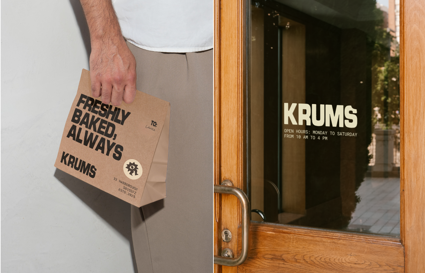
Krums is a UK-based café and pastry shop where freshly baked goods take center stage. Every product is baked on the spot using organic ingredients, turning each visit into a sensory experience of warm aromas, honest flavors, and handcrafted recipes. Krums aims to be more than just a bakery: it is a space where craftsmanship, freshness, and care define everything that is made.
→Solution
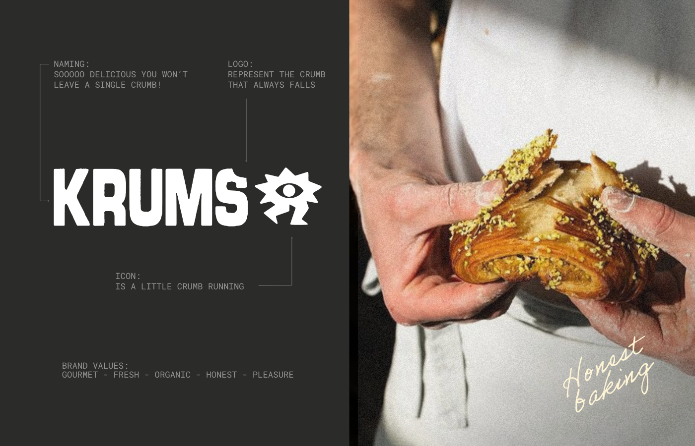
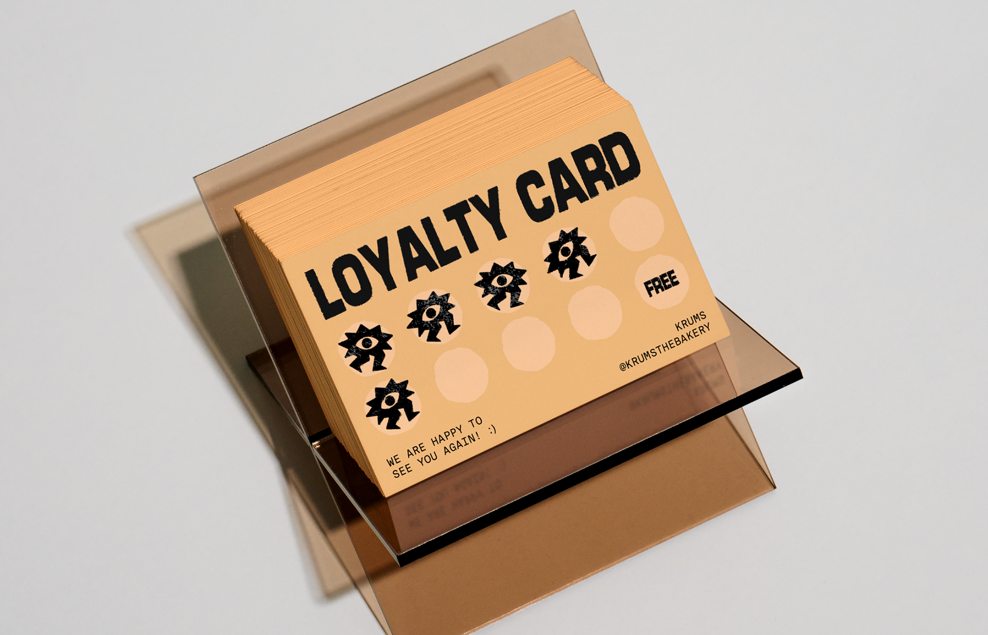
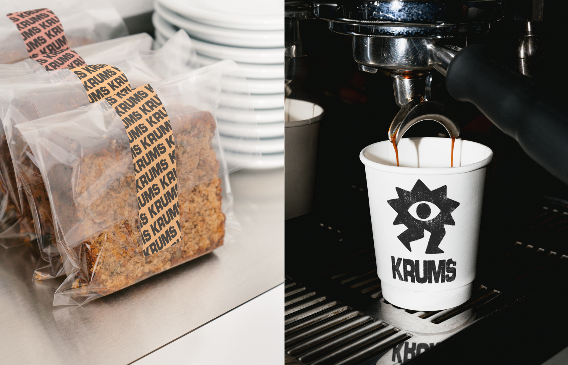
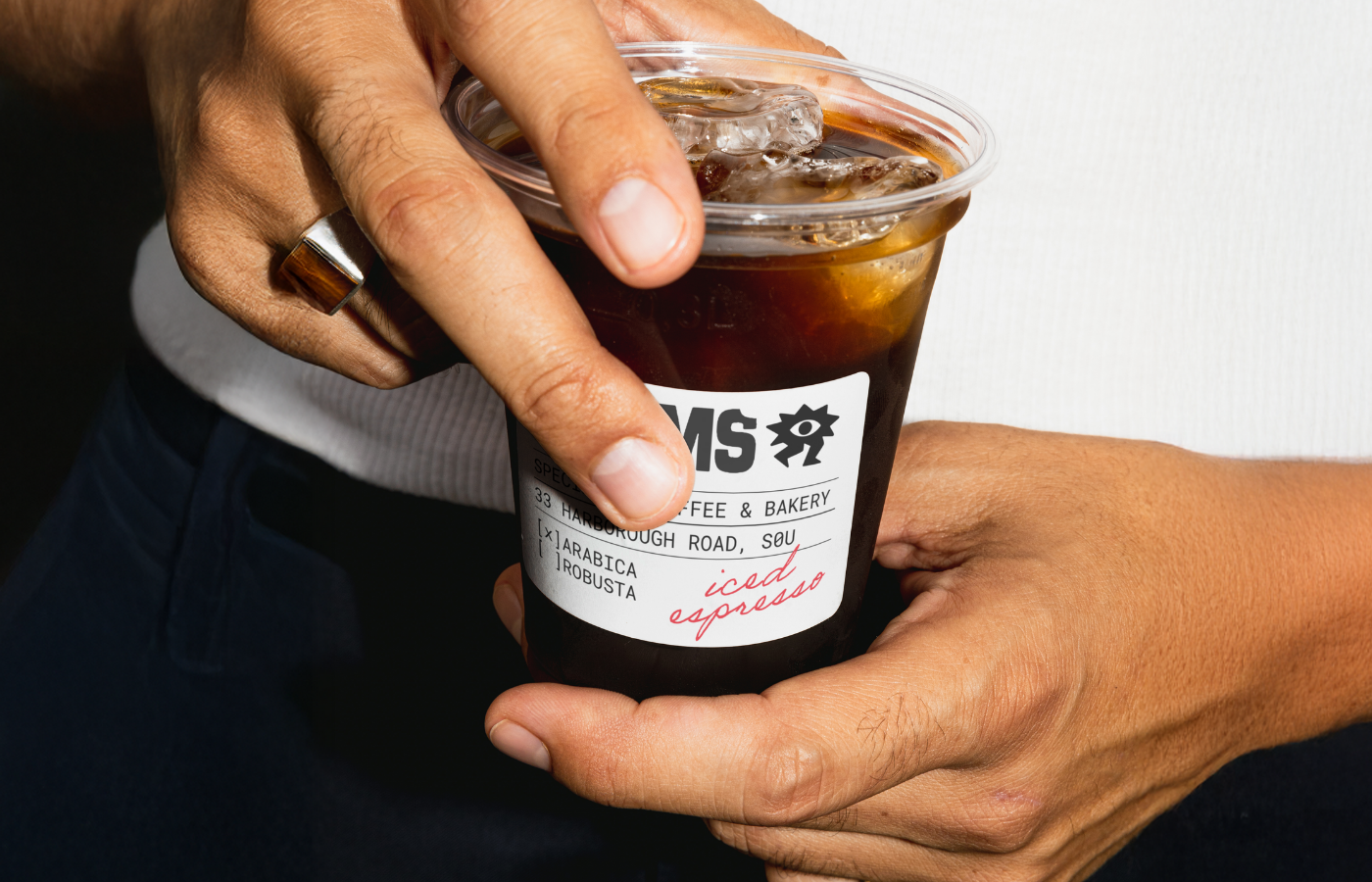
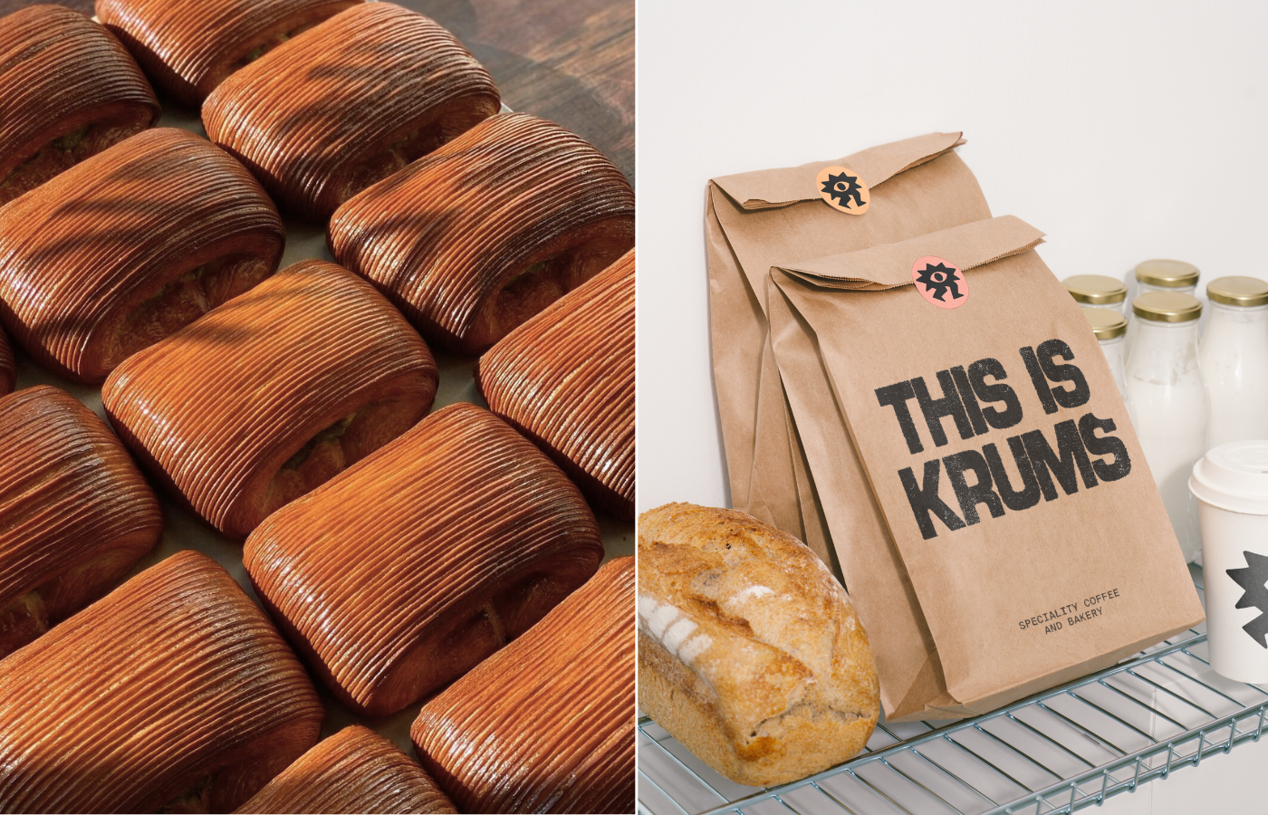
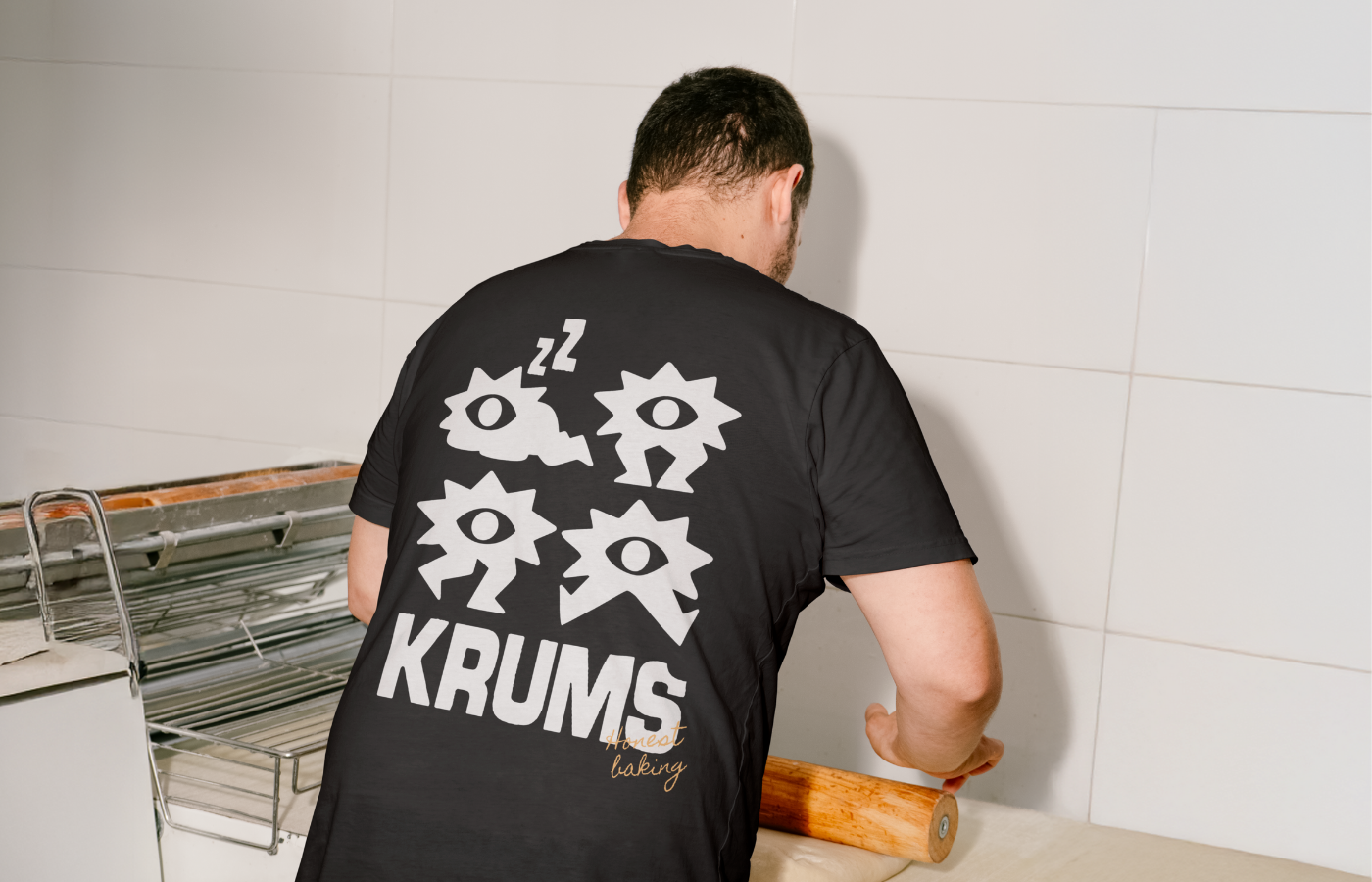
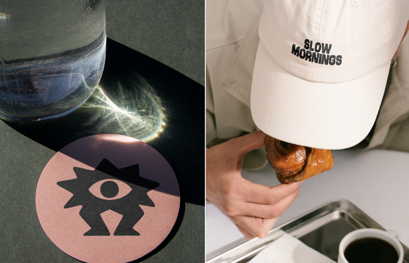
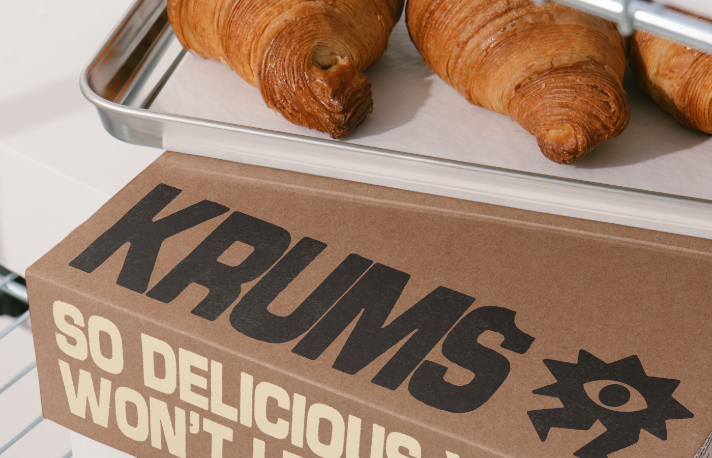
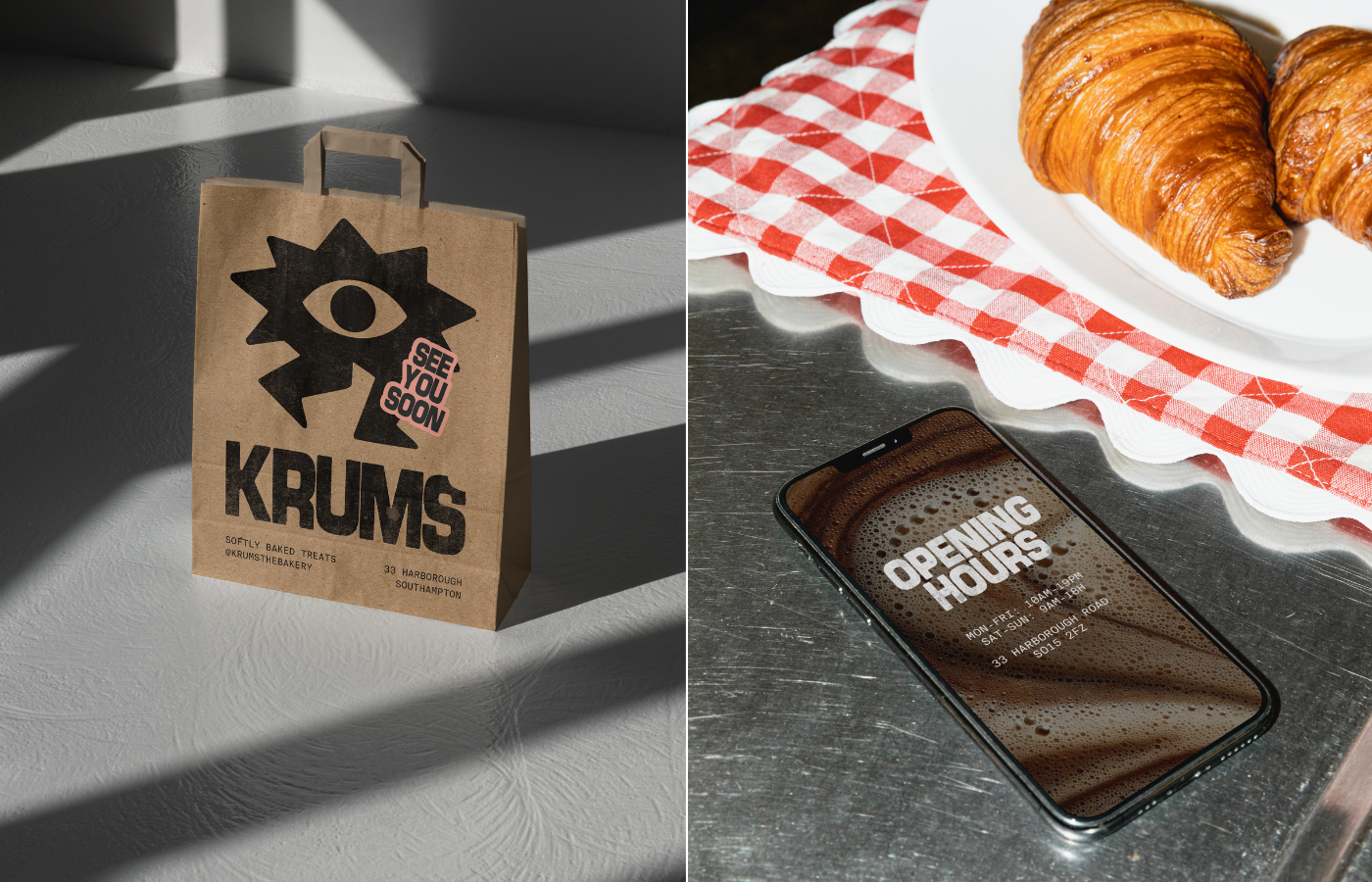
The brand identity’s main goal was to communicate Krums’ commitment to natural ingredients and gourmet flavors. To achieve this, the visual strategy is bold yet warm. A strong bold typeface makes the brand stand out and feel expressive, while a monospaced typeface brings a crafted, detail-oriented vibe that reflects the care put into every product. A handwritten typeface adds a human and close touch, reinforcing the idea of baking made by real people, for real people. The color palette was chosen to evoke nature, freshness, and raw ingredients. To strengthen the concept, a playful character — a running crumb — was created, adding personality, movement, and memorability to the brand.
→Services
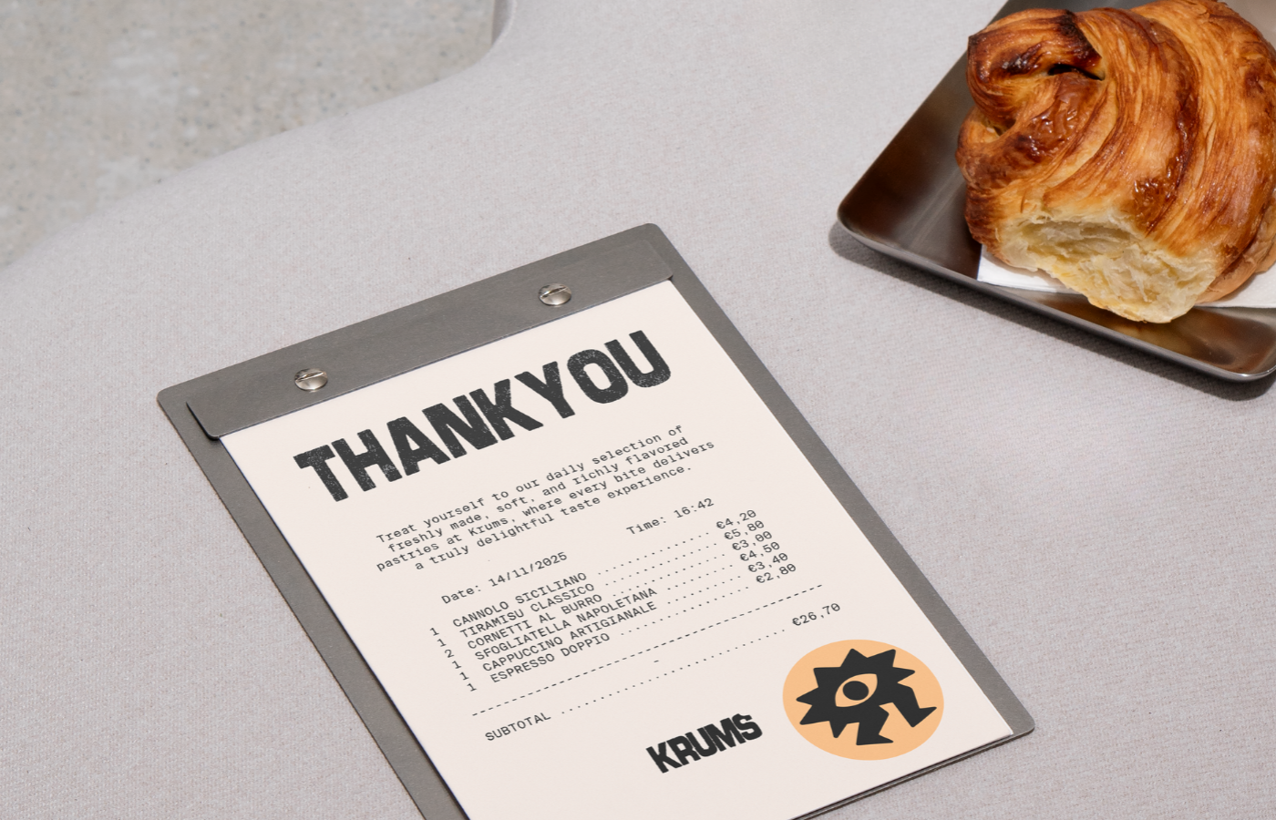
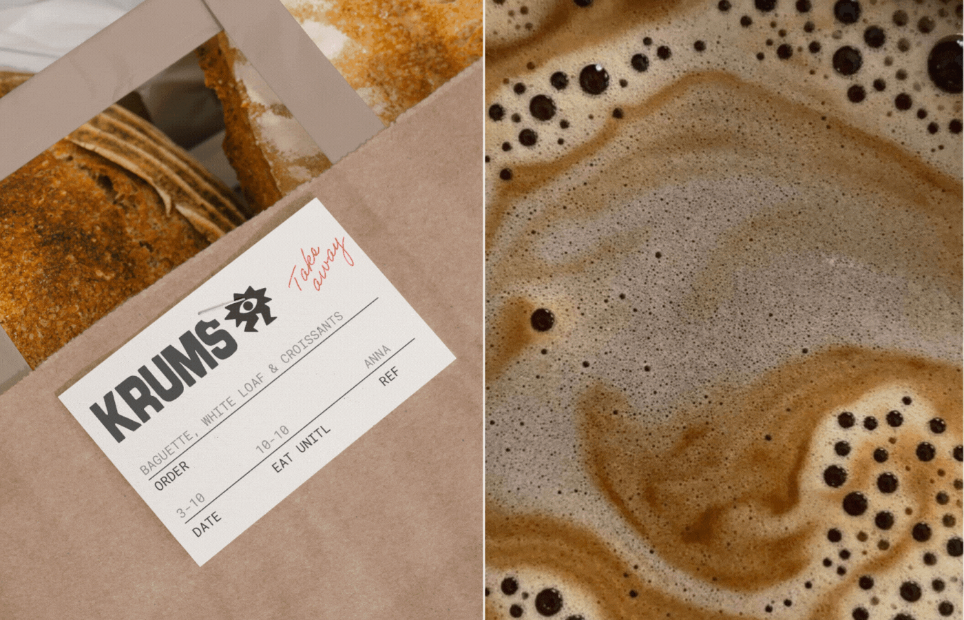
Naming · Logo Design · Brand Identity · Packaging Design
Thanks for the scroll!
MIRIAM FANECA
Graphic Design, Art Direction & Creativity
Graphic Design, Art Direction & Creativity
Let's connect → miriamfaneca3@gmail.com
Follow me → @miriam.faneca
Follow me → @miriam.faneca
:)